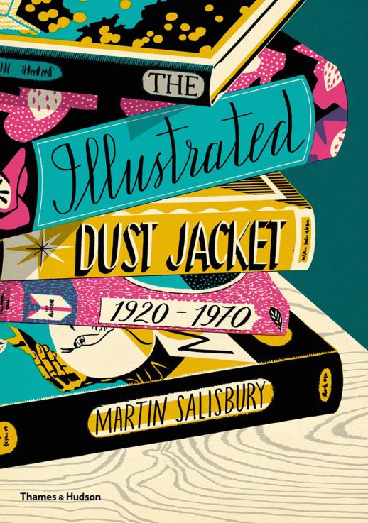
 The Illustrated Dust Jacket 1920-1970 by Martin Salisbury
(Thames and Hudson, hardback, 200 pages. Out now and available here)
Review by Frances Castle
The first book jackets or dust covers were just plain wraps of thin paper meant to protect a book in transit, and it wasn’t until the turn of the 20th century that book cover design as we know it began to develop. Starting with Bloomsbury, and the Art Deco-style covers they produced in the 1920s and 1930s, The Illustrated Dust Jacket 1920-1970 takes you through 50 years of book jacket design in the 20th century.
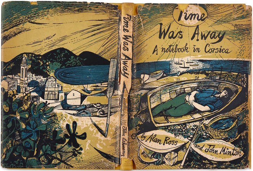
The postwar era saw the rise of Neo-Romanticism, inspired in part by the visionary landscape painting of Samuel Palmer and William Blake. Many of the artists who were loosely involved with this movement worked across a wide range of fine and commercial arts – Graham Sutherland, John Minton, Edward Bawden and Edward Burra to name a few – and it was perhaps this crossover that produced a golden age of book design. John Lehmann, who set up his short-lived publishing house in Covent Garden in 1947, produced some of the most important illustrated books of the 20th century. Other publishers also contributed to this highly productive period, including names still familiar today, such as Hamish Hamilton and Faber & Faber. As in most areas of the commercial arts, the style of cover design through the 20th century reflected the fashions and ideas of the times, but many artists – particularly those with a ‘fine art’ background – were able to transcend this, and employed their own voices, unaffected by vogues and trends.
By the mid 1950s the mood had begun to change as technology and and consumerism took hold. Non-fiction books started to promote the idea of ‘lifestyle’, displaying images of home furnishing, international travel and cuisine. The children’s picture book and Annual market was booming, with brightly coloured, attention-grabbing covers. In the US, the strong tradition of realist painting, by artists such as Norman Rockwell, Walter Biggs and Dean Cornwall, co-existed with more design-based solutions.
Starting with Edward Ardizzone, the book includes over fifty chapters dedicated to individual artists who worked across the discipline in the 20th century. Stanley Badmin’s topographical drawings of the English countryside sit quietly next to the similarly themed but colour saturated work of Brain Cook, and the covers he did for Batsford. Early examples by Vanessa Bell of the work she did for the Hogarth Press, partially for the books by her sister Virginia Woolf – the seemingly crudely designed shapes that often only hinted at the story within – have since become design classics inseparable from the books themselves.
My particular favorites are Clifford and Rosemary Ellis and the innovative work that they did for the New Naturalists series: they seemed to be able to marry a strong design aesthetic with the themes and shapes of the natural world, often playing with negative space and the placement of text. The Ellises oversaw every element of the design process, printing the covers on rough matt paper that gave them an organic feel, and paying great attention to the way the spines were designed, and how they would be read independently of the cover when sitting on a shelf.
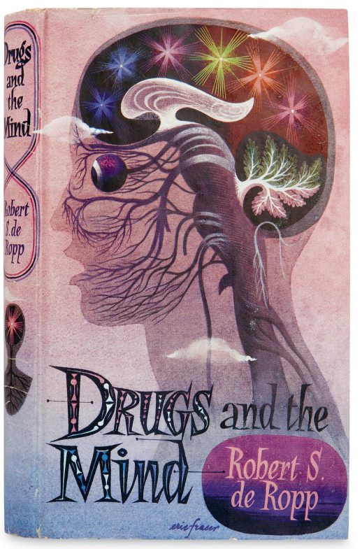
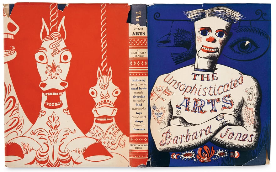
Also included are the dramatic design skills of Eric Fraser, whose work seemed to excel within the boundaries of commercial art, and Barnett Freedman, born in the East End to Jewish immigrants, and one of the finest illustrators/designers of the 20th century. Big American names such as Milton Glazier and Edward Gorey also stand out – perhaps both better known for work in other fields than book jacket design. Tove Jansson is included, with the wonderfully designed covers she did for her own Moomin books, along with Barbara Jones and her folk art inspired work.
Artists seemed to embrace the technical limitations of the time — colour palettes were often restricted, and it wasn’t until the 1950s that four-colour lithography became generally used. Before this, individual colours had to be laid down separately in the printing process, and artists would specify each colour used. This led to inventive colour work, sometimes using two colours overlaid to create a third. Type was lead set and often clunky, which may be why so many illustrators and designers used their own hand lettering to such striking effect.
This is a celebration of book art at a time when book covers are more vital than ever – they now have to persuade the buyer to pick up a physical book over the option of a download. Wrapped in a stunningly designed jacket by contemporary illustrator William Brag, the book is large enough to print many of the covers at close to full size, on crisp matt paper that really shows the artwork at it best. It is a beautiful book, about beautiful books.
*
Frances Castle on Caught by the River / Frances’s website